Solo UX/UI Designer
UX Researcher
Improving ROI and target audience reachability for a small online brand.
Nicole's Designs is a small online brand that sells baby clothes, home décor, assists in party planning, and offers custom options for all the above.
It relies on Etsy and social media as its main sources of digital presence.
Problem
With an oversaturated market, my client wanted me to develop an MVP that would help towards the following:
- increase discoverability in the aspect of standing-out via brand values
- increase ROI and improve conversation rates as products received hundreds of views but not an equal amount of sales
- CTA to collect leads that would benefit the brand into future ventures
Requirements
I was given complete creative control as long as my client could still utilize Etsy.
Scope
The MVP was required to be approached with agility (3 weeks) on a $0 budget.
After 3 weeks, I created a high-fidelity clickable prototype website template that focused on being an additional channel while acting as a "buffer" between social media channels and Etsy to relay Nicole's Designs' values, reduce transitional channel friction, and instill buyer confidence.
By having a page slightly more expanded than that of a landing, it provided a more personalized experience which led visitors to understand the brand's mission while being able to gather the necessary information needed before quickly re-directing to Etsy checkout.
Positive feedback resulted in a better understanding of the brand (compared to just social media channels) and a willingness to make a purchase after being able to feel a personal connection with the MVP.

After speaking with my client, I was excited to begin as I knew I could bring elements of my past experiences into my current UX/UI situation.
The brand still being in a stage of infancy (no pun intended) meant I had the opportunity to be a direct positive influence and wanted to make the most of this experience.
I knew Nicole's Designs niche segmentation meant researching competition, target audience, and related necessary information would present itself as an advantage.
Secondary research solidified baby brands are expected to expand in demand and will remain profitable - Nicole's Designs has strong value that could lead to high success after a timeline of optimization and I wanted to be the initial step towards that.
 |  |
After my initial client interview, I created a proto-persona that was based on shared customer insights as well as a scan of public social media information - followers, comments, and other related interactions helped form a general vision of what my MVP's target audience was.
Michelle Brown was created to visualize what was honed into being the brand's main customer group on a more in-depth level.
Empathy Map
My proto-persona represented data research findings in relation to audience demographics and key psychographics.
It led me to discovering expectations, frustrations, likes, wants, needs, and desires that I could remain empathetic towards within my ideas and overall design process.

A 5 minute "How Might We" whiteboard session enabled me to correlate research findings thus far and transform it into key challenges, re-alignment with client goals, priorities, and continue a stride towards informed decisions.
My priorities were:
- organize product architecture specifically towards SEO opportunities and opportunities to differentiate from competition
- utilize niche scenario as a way to increase/inspire design efficiencies
- maintain frictionless user experience
- maintain harmony with client goals
- be mindful of brand's future profitability

User Journey
By creating a user journey diagram, I could shift my perspective to that of my proto-persona as a way to uncover expectations, touchpoints, actions, problems, and solutions.
The scenario Melissa Browne had been devised to undergo was finding a memorable gift for her friend's 5-month-old daughter.
Notable pain-points included avoiding cognitive overload through a plethora of similar options while trying to use available time for quick research as effectively as possible.
With the ideal scenario being Melissa finding Nicole's Designs through an organic touchpoint, ideas within how to use this interaction period to solve for client goals were formed.

Story Board
My storyboard was useful for visualizing and planning the user experience related to Nicole's Designs's target audience with my MVP in a linear start-to-finish form.This also helped me think through the various steps and decisions that a user will need to make in order to complete a task, and help me identify potential areas for improvement towards challenges.
The purpose of creating a story board was to visualize how my proto-persona would interact and react to my eventual MVP relevant to the data discovery reflected in a humanistic approach.
The buyer journey was important to understand as it helped pinpoint how ideas could facilitate a successful flow from organic entry touchpoint to exit.


Crazy 8's was a rapid ideation technique that involves creating eight different design ideas in a short amount of time (under 10 minutes).
By doing this, I quickly generated a diverse range of ideas and identify potential directions for design elements.
This also let me think divergently in relation to creative solutions I might not have considered otherwise.
Crazy 8's quickly prototyped my ideas to get feedback which helped save time.

The user flow was a breakdown of elements led back to client goals, persona goals, ideas, and findings of frustrations that should be addressed found through ongoing client conversations that furthered the understanding of Nicole's Designs target audience.
I wanted to ensure elements would provide solutions for both the brand's vision and eventual MVP users.
The idea of an accessibly simplexic product based in the ability to quickly understand the brand led to an approach of tailored minimalism relying on strong copy that satisfied ecommerce expectations.
I knew the additional step of navigating from the brand's social media to this page could discourage customers as creates additional steps - reduced friction (both actual and perceived) was going to be key.


After iterations from mentor feedback, conversations with my client, and browsing inspiration through the means I had within my past role as a sales development representative, I came to a finalized list of sub-tasks related to MVP goals:
- increase discoverability: SEO, instill trust through brand story-telling, display value of items, friction reduction, accessibility, memorability through expressive color palette/overall theme
- increase ROI: emphasis on hierarchy and content organization, further brand personality (including beliefs and mission), encourage customer interaction to drive a social level of brand loyalty
- collect leads: increase conversions through offer-based model of membership discounts, exclusive deals, and other displays of customer appreciation


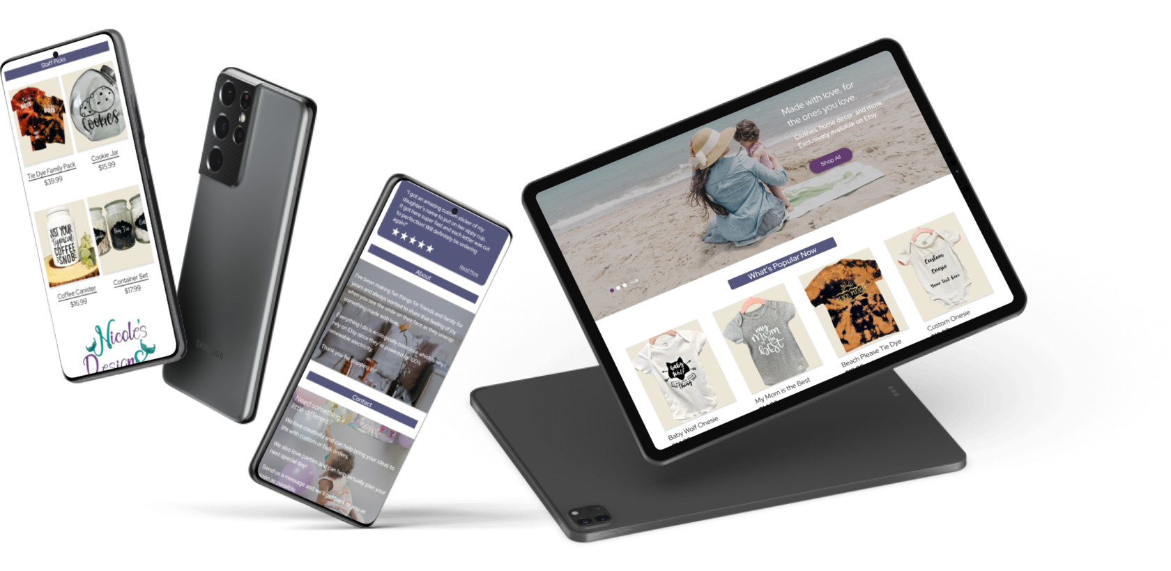
Next, I created a clickable mid-fidelity prototype that would be key for user testing.
This prototype kept the crux of initial concepts but was slightly altered to suit client levels of digital literacy..
A crucial ideology surrounding this prototype was to include both passive and direct ways to link the user to the appropriate content - this meant clickable images and directly labeled links.
I wanted to ensure that any possible differentiation with interaction would result in a re-direction to content with the reduction of friction (both perceived and actual).

Because I was given full creative control, I decided to choose imagery that reflected the brand's origins of being based in California that aimed to portray youth so users could tell what the digital product was immediately upon entry touchpoint.
I also wrote content that explained Etsy was the main channel where a transaction would take place because Nicole's Designs's mission is to provide cost-effective products that are sustainable.
Typefaces were chosen based on client approval and to match pre-established guidelines.
Product images were edited to reflect the color palette that complimented imagery and reflect the brand colors of teal and purple.
As previously stated, toned down colors were to reduce cognitive overload while informing the user as to how to navigate elements that were strategically placed to create value around CTA touchpoints.
"Etsy’s 100% renewable electricity commitment includes the electricity used by the data centers that host Etsy.com, the Sell on Etsy app, and the Etsy app, as well as the electricity that powers Etsy’s global offices and employees working remotely from home in the US."


Due to the agile time-frame, I interviewed 5 participants that were directly within target audience demographic via personal connections.
The moderated semi-structured setting consisted of answering 6 questions and 6 scenario based tasks that tested element alignment to client needs and experience improvement - I also used this time to collect feedback to identify usability trends).

Users favored Amazon (for their ability of fast shipping) and relayed that ordering from a small business does not "make or break" their decision as if they want something, they will make the purchase if the source comes across as a legitimate identity.
There was appreciation that the page re-directed to Etsy which was purposely implemented for both the client and reasoning for relevant content that concentrated on establishing journey expectation - Etsy's largescale and reputable presence worked to the advantage of instilling buyer confidence.
Re-direction was not perceived as friction, but users did not feel connected to brand's personality enough to have their interest held - there was a neutral sentiment towards the visual design aspects as well.
I now understood that my vision was more aligned than I had originally thought it would be but needed to be further iterated upon to reach my MVP.

After consulting my mentor as well as relaying the user testing data with my client, I developed my MVP to expand upon what lacked in the previous prototype.
The final prototype was heavily constructed upon content to expand upon the lack of connection between the brand and user.
There was also an additional element of utilizing customized party planning as another form of lead collection (originally just reliant on social media engagement) as a last minute request via my client.
My client conveyed extreme appreciation and gratitude as I also included detailed attachments of ensuring SEO, the importance of alt text for images, and a responsive mobile version (this was not an original requirement).
If I had more time, I would have liked to re-test original usability test participants.
Given the time restraints and agile scope of delivery, this was not addressed as a requirement, but still can easily be conducted in the future.
Thank you for reading and remember to think big by shopping small!
LET'S CONNECT!
